
CONTACT ME

DAVID INMAN
The Last Bookstore LA
Site Rebuild Proposal
The best worst book website ever. Tone is everything.
Work Scope
Research & Interviews
Heuristics | Competitors | User Flows

Wireframes & Concepts
Sketching | Prototype | Usability Tests
Final Design & Outcomes
Hi Fidelity Prototype | Stakeholder Presentation
All while retaining the aesthetics and vibe the owner needs to maintain.
Devise a workable navigation leading to product sales.
Apply site uniformity in typography, color palette, icons, and graphical style.
Increase site trustworthiness for customers not familiar with the bookstore.
Primary Challenges:
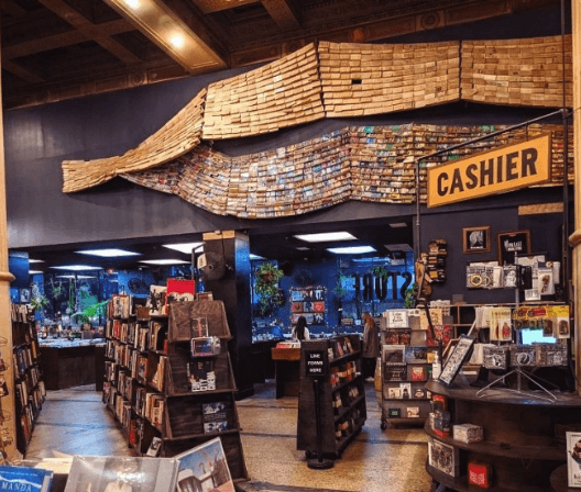
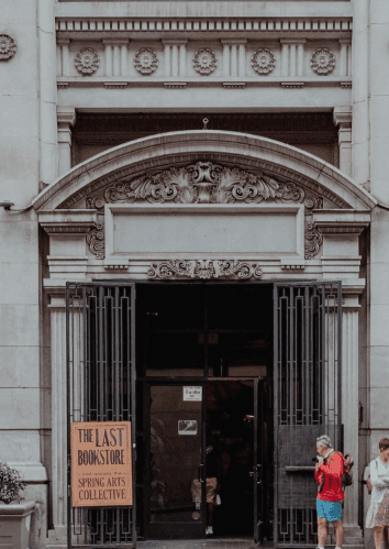
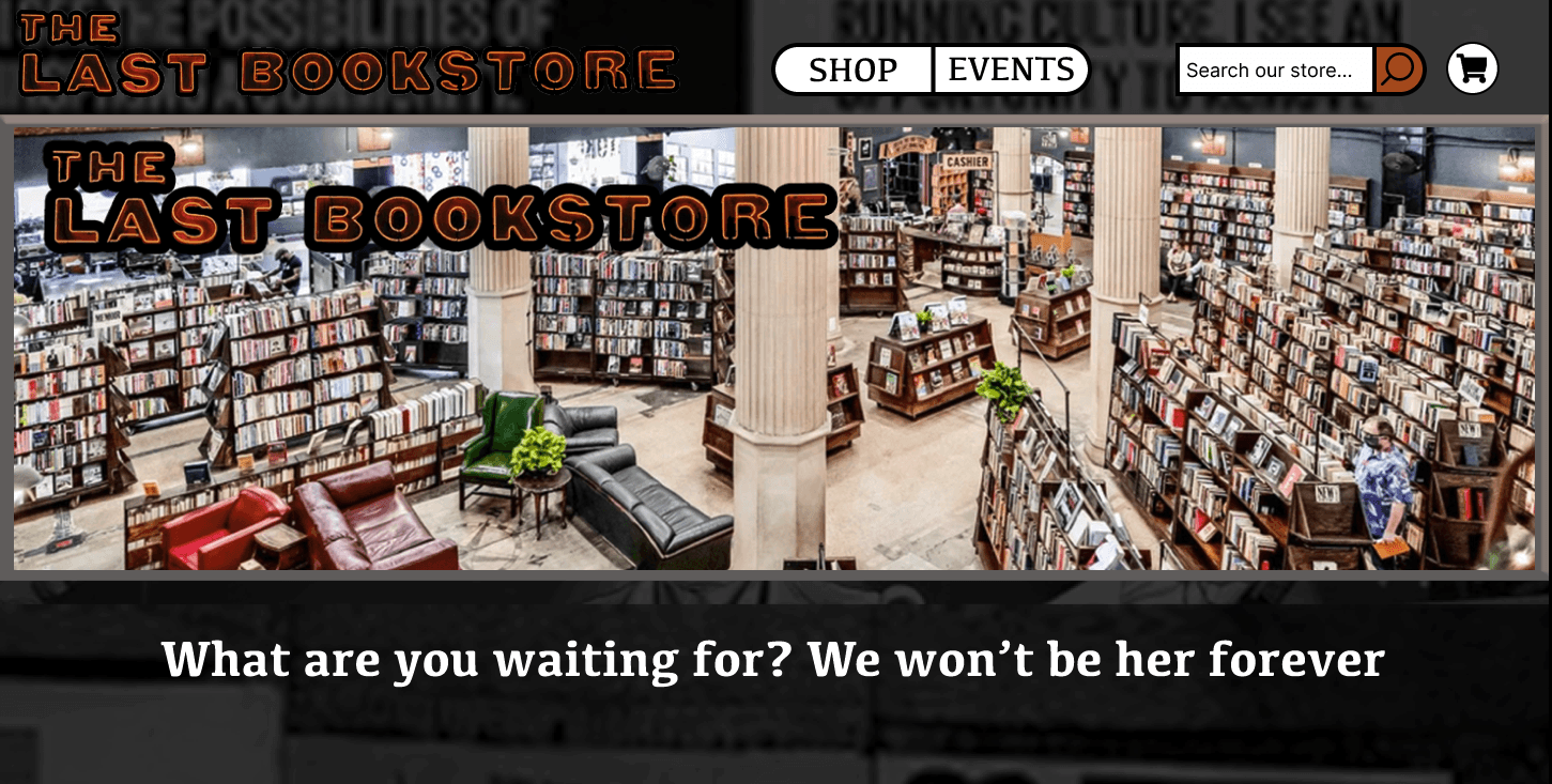
www.thelastbookstorela.com - website for an iconic independent bookstore in Los Angeles. A community center for local events, shows, and book readings with an alt/punk vibe. A safe haven for bibliophiles and people who want to disconnect from or learn more about the world.
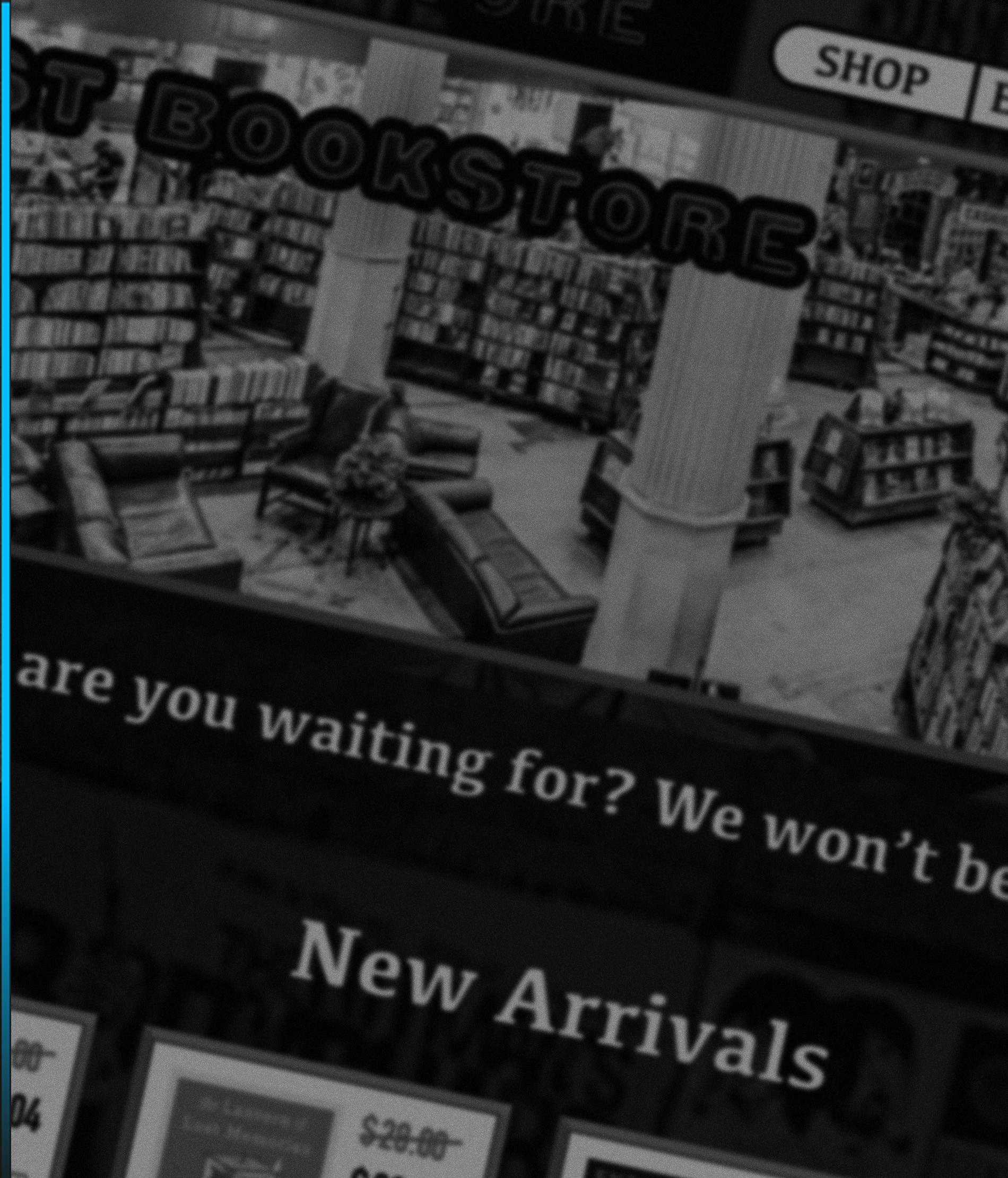
Also home to some of the worst UX decisions you will every see on a website.
About the project
CONTACT ME
DAVID INMAN
The Last Bookstore
Site Rebuild Proposal
Research & Interviews
Heuristics | Competitors | User Flows
Wireframes & Concepts
Sketching | Prototype | Usability Tests
Final Design & Outcomes
Hi Fidelity Prototype | Stakeholder Presentation
Work Scope
All while retaining the aesthetics and vibe the owner needs to maintain.
Devise a workable navigation leading to product sales.
Apply site uniformity in typography, color palette, icons, and graphical style.
Increase site trustworthiness for customers not familiar with the bookstore.
Primary Challenges:
www.thelastbookstorela.com - website for an iconic independent bookstore in Los Angeles. A community center for local events, shows, and book readings with an alt/punk vibe. A safe haven for bibliophiles and people who want to disconnect from or learn more about the world.
Also home to some of the worst UX decisions you will every see on a website.
About the project
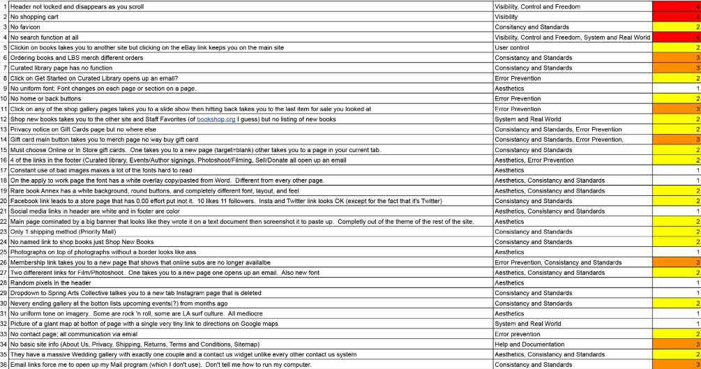
To fix the site’s issues, I first needed to understand them. I conducted a detailed evaluation using Nielsen’s 10 Usability Heuristics and stopped when I reached 36 violations.
With my initial sketches and wireframes, I planned to fix all navigation and branding issues, creating a site comparable to other major online bookstores.
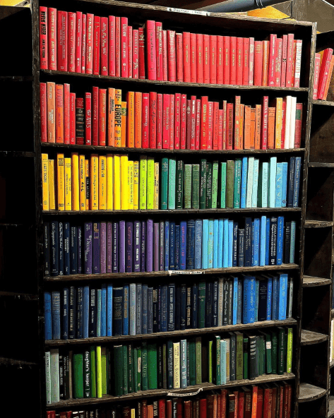
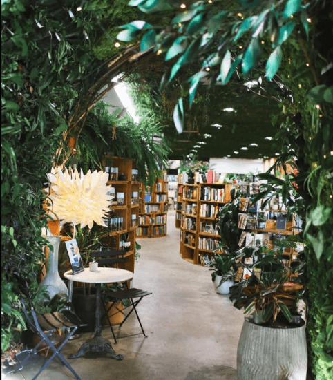
However, as I worked, I realized that the existing site – chaotic as it was – actually served an important purpose: representing the alternative “punk rock” LA community vibe that the owner wanted.
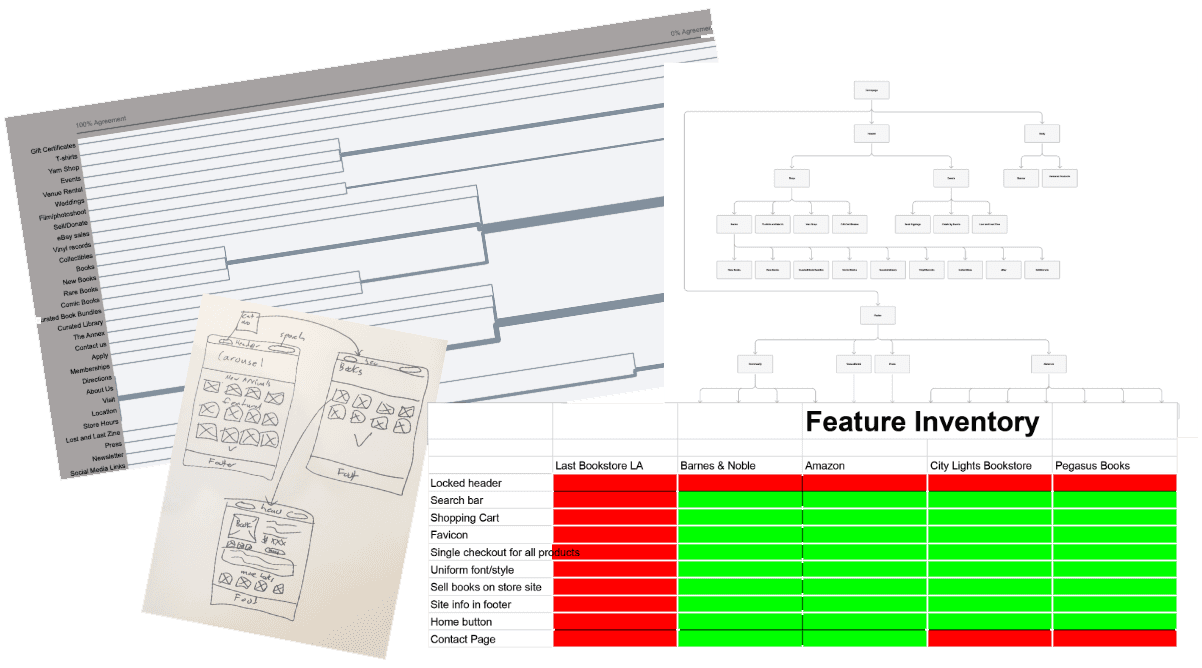
I conducted a competitive feature inventory and usability tests based on these initial findings. Users participated in card sorts to inform the new site map, which aligned with typical user expectations. From there, I began sketching concepts.
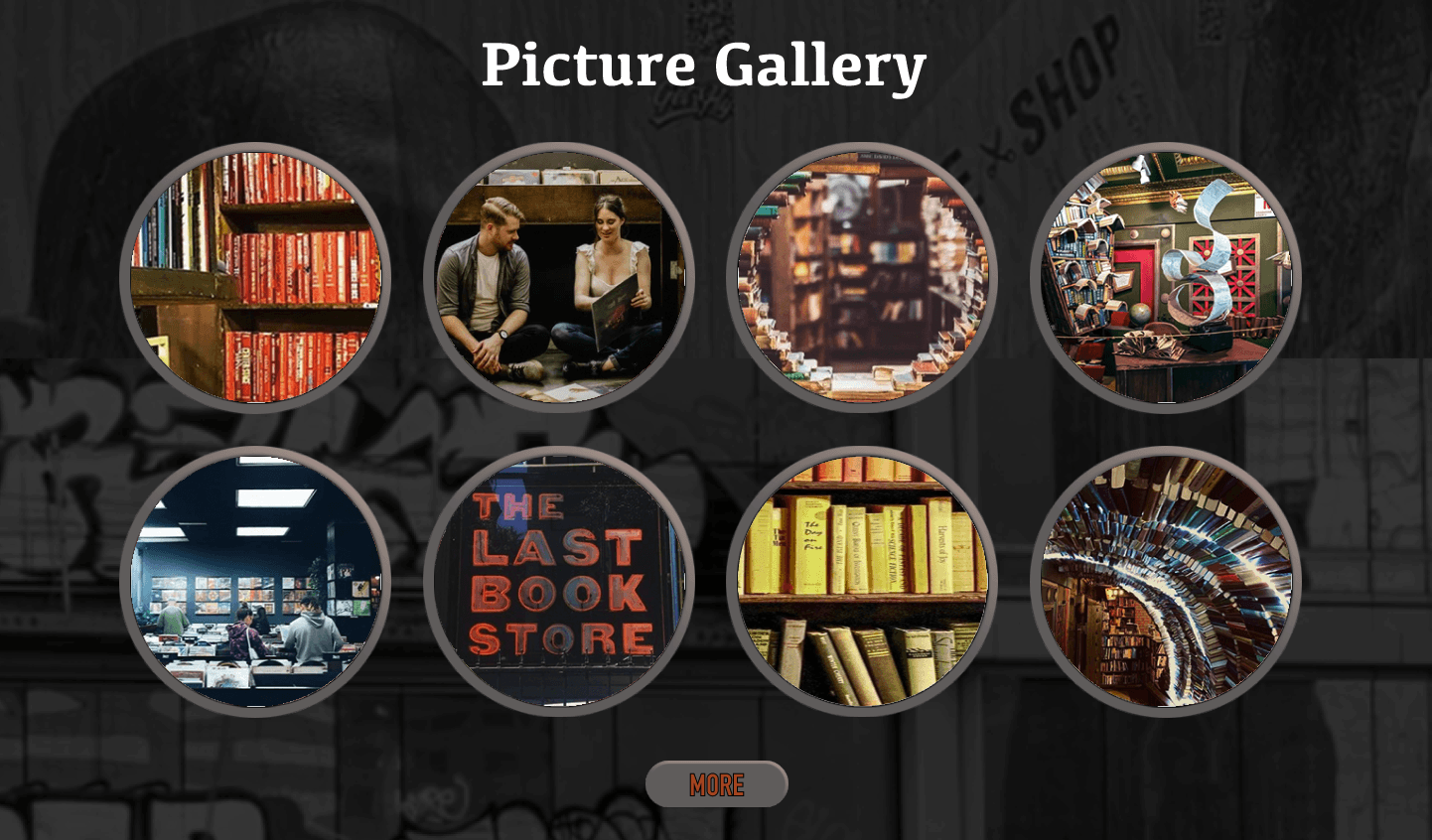
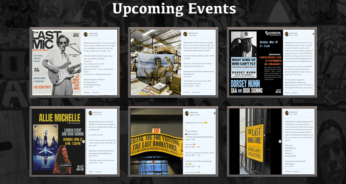
Understanding that the owner would rather not sell any books online than compromise on aesthetic standards, I redesigned the color palette, typography, and layout. I added edgier graphic elements and prominently featured the gallery, reviews, and community events with an LA twist – all integral to the Last Bookstore LA’s success.
Of course, I also resolved all critical navigation issues.
Let's Connect!
And make your next project a reality
I LOVE MEETING NEW PEOPLE!
CONTACT ME
Work
Resume
Contact

2024 David Inman
Let's Connect!
And make your next project a reality
I LOVE MEETING NEW PEOPLE!
CONTACT ME
Work
Resume
Contact
2024 David Inman
DAVID INMAN

Work Scope
Research & Interviews
Heuristics | Competitors
| User Flows
Wireframes & Concepts
Sketching | Prototype
| Usability Tests
Final Design & Outcomes
Hi Fidelity Prototype
| Stakeholder Presentation
About the project
www.thelastbookstorela.com - website for an iconic independent bookstore in Los Angeles. A community center for local events, shows, and book readings with an alt/punk vibe. A safe haven for bibliophiles and people who want to disconnect from or learn more about the world.
Primary Challenges:
Devise a workable navigation leading to product sales.
Apply site uniformity in typography, color palette, icons, and graphical style.
Increase site trustworthiness for customers not familiar with the bookstore.
Also home to some of the worst UX decisions you will every see on a website.
All while retaining the aesthetics and vibe the owner needs to maintain.
To fix the site’s issues, I first needed to understand them. I conducted a detailed evaluation using Nielsen’s 10 Usability Heuristics and stopped when I reached 36 violations.
I conducted a competitive feature inventory and usability tests based on these initial findings. Users participated in card sorts to inform the new site map, which aligned with typical user expectations. From there, I began sketching concepts.
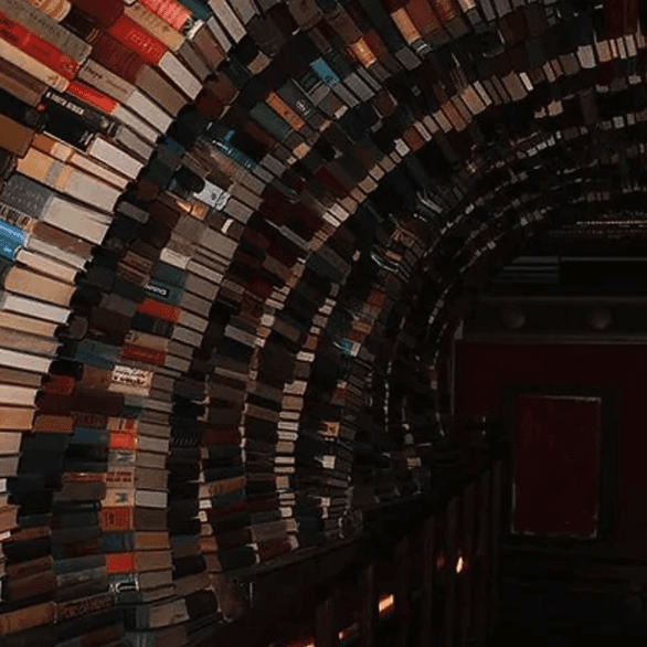
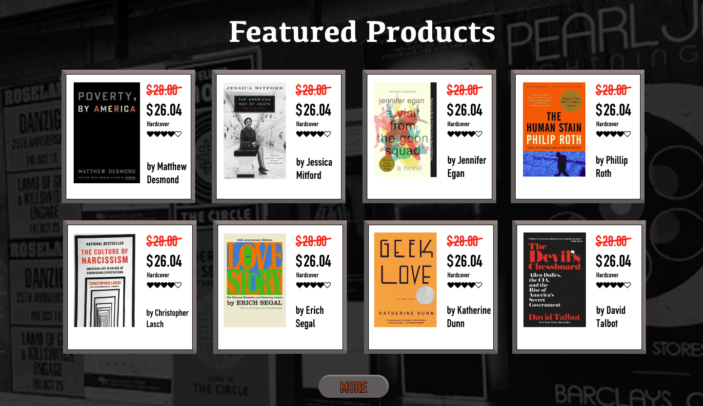
I'd shop here.
With my initial sketches and wireframes, I planned to fix all navigation and branding issues, creating a site comparable to other major online bookstores.
However, as I worked, I realized that the existing site – chaotic as it was – actually served an important purpose: representing the alternative “punk rock” LA community vibe that the owner wanted.
Understanding that the owner would rather not sell any books online than compromise on aesthetic standards, I redesigned the color palette, typography, and layout. I added edgier graphic elements and prominently featured the gallery, reviews, and community events with an LA twist – all integral to the Last Bookstore LA’s success.
Of course, I also resolved all critical navigation issues.
2024 David Inman
Site Rebuild Proposal
Last Bookstore